

Small business owners often have a bit of difficulty deciding whether to simply pay for the services of a PPC management company or launch an all-out SEO campaign, especially considering the latest SEO trend.
Perhaps it will make the decision easier if you consider the fact that much has changed in the landscape of SEO in recent years, and that includes SEO for small businesses. It has now become a lot easier for small businesses to engage in SEO without spending too much.
But of course, if you want to compete with established businesses with practically unlimited budgets at their disposal, you will have to go about SEO smartly. And one of the smartest ways to do SEO is to adjust according to the current SEO trends.
In this article, we will talk about the latest change that just might have a great impact on the world of optimization. If you can adapt quickly to this change, your small business will have a much better chance of successfully competing with larger corporations.
What’s the Latest SEO Trend?
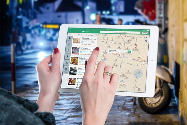
Google’s mobile-first indexing, which prioritizes the mobile version of websites, remained a significant SEO trend. Google ranks search listings according to mobile versions of web content. This is true even for the search results of desktop users. The index will only consider the desktop version when there is no mobile version available.
If you think this is a sudden change on the part of Google, think again. Google has been gradually moving towards this update for some time now. Google posted details regarding the index on their blog back in November 4, 2015, marking the first obvious hint.
If you’ve been paying attention, you’ll understand that this update reflects the growing number of searches conducted via mobile devices. Google felt the need to make this change because they want their index and search results to represent the majority of users, which now primarily consists of mobile users.
If you have resisted going mobile until now, you should STOP. Resistance is futile, so to speak. Mobile is here and it certainly looks like it’s here to stay. It now dominates search, and other search engines are expected to follow Google’s lead in placing more emphasis on mobile search. You need to take the appropriate action.
Understanding the Shift in Mobile Optimization Strategies
Now that you are aware of the SEO trend and Google’s mobile-first indexing, it is understandable for you to worry if you still do not have a mobile website. But Google says you shouldn’t.
As long as your website and content are properly optimized, Google will continue to crawl and index your existing desktop site, ensuring that you remain in good standing. Remember, though, that they do want you to have a mobile website and there is always the possibility that they will soon scrap their desktop user agent in favor of the mobile user agent. So it is still best to create a mobile website or at least make your existing website responsive.
If you do choose to create a mobile version of your website, make sure the links and content on it are similar to the ones on your desktop website so Google can index the right content, and your search rankings will be just as good as it was before the launching of their mobile-first index.
Now, what if you do have a mobile website, but it has much less content than your desktop site? Should that be a cause for worry?
It could be.
With the recent update, Google places more importance on the mobile version of websites. This means that if you have both a desktop and a mobile site, Google will only index your mobile site. Therefore, if your mobile site has considerably less content than your desktop site, Google will not index much of your content. That would be a shame, wouldn’t it?
Fortunately, there is a solution. Go for the responsive approach. With this approach, the content on the desktop and mobile versions of your site is the same, and that goes for the links as well.

It certainly pays to have a mobile website or make your existing website mobile-friendly.
Has the Mobile-First Indexing Been Fully Rolled Out?
Mobile-first indexing is a big deal in the world of SEO. It means search engines like Google primarily use the mobile version of a website’s content to rank pages.
But has Google completed this change everywhere?
The answer isn’t a simple yes or no. Google has been gradually rolling out mobile-first indexing across websites. This means some sites might already have fully optimized for it, while others are still in the process. The rollout depends on various factors, including site readiness and Google’s prioritization. So, if you’re wondering if mobile-first indexing has reached your website, it’s worth checking your Google Search Console. There, you can find notifications indicating whether your site has been migrated. Staying updated on this SEO trend is crucial for maintaining or improving your website’s search engine visibility.
How Do You Prepare for This SEO Trend?
There is not much difference between SEO for large corporations and small business SEO. So regardless of how big your business is, you will have to optimize it for the mobile-first index in much the same way. Here are the things you can do to make sure you’re ready for the full roll-out of Google’s index:
1. Give Your Site a Mobile Design
Through the years, SEO has transformed from a purely technical process to some sort of art. Anybody who wishes to be an SEO practitioner these days needs to understand not just ranking signals and code, but also the use of design to improve search rankings.
So, how do you optimize your mobile site design? Here are a few tips:
- Adopt a “finger-friendly” design. Mobile users typically navigate sites using their fingers, so it makes sense for your site design to be finger-friendly. What does being finger-friendly mean? Well, it simply means that your site design should make it easy for users to scroll and tap, with little to no room for accidental taps.
- Avoid Flash. A lot of mobile users cannot view Flash elements, so it is best to remove these elements from your website. Use HTML 5 or Java instead.
- Ditch the pop-ups. Yes, it is important to generate leads, but that doesn’t mean you have to fill your site to the brim with pop-ups. Pop-ups are frustrating for most users and are among the common reasons for people leaving sites. So if you want to maintain a low bounce rate and good search rankings, ditch the pop-ups.
Mobile users navigate with their fingers, so it’s best to give your website a finger-friendly design.
2. Improve Your Site Speed
According to Google’s Developer Programs Tech Lead, the threshold for the acceptability of an e-commerce site is only two seconds. That’s right. TWO SECONDS. Today’s site users expect all websites to load fast, and Google goes even further by rewarding sites that can load in less than half a second!
If you want to optimize your site’s speed, here are some things you should consider:
- Minify the codes. This means removing unnecessary characters from your source codes without sacrificing functionality.
- Optimize the images. Make sure all images on your site are just the right size because images that are too large can slow down your site.
- Minimize the redirects. Too many redirects slow down a site as well.
3. Work on On-page Optimization
There is typically less room for you to work with where mobile search results are concerned. This is why you have to ensure that your titles and Meta descriptions are straightforward and concise. Do your best to make sure the Google bot quickly understands what a specific page is all about and that users immediately know what kind of content they’ll see. This will help improve both your rankings and click-through rates.
4. Allow CSS, Images, and JavaScript
When people started creating mobile websites, it was advisable to block these elements because they usually slow down the site. These days, however, mobile devices are a lot more powerful and are capable of handling practically anything you throw their way. And because Google wants to see and categorize the same content users see, it is now helpful for you to allow these elements.
5. Ensure Local Optimization
When it comes to SEO trends, small business owners are typically advised to optimize for local search, and good reason. Back in September, Google released a major update on their local search algorithm. This update is called Possum, and it takes into account the fact that about half of the people who conduct local searches on mobile devices visit a store within the same day.
Make sure your business name, address, and phone numbers are indicated in your title tags, alt tags, H1 headings, URLs, Meta descriptions, and content.
Google is hoping there won’t be a significant impact on rankings when the new index is fully rolled out. Nevertheless, you should make sure you’re ready by following the tips above.